Email Design System
The Email Design System is an extension of the Airbnb DLS — a unified set of reusable components and lockups for designing email across transactional and marketing surfaces. I created and facilitated email components alongside art directors, designers, and engineers, keeping templates accurate and up to date, and authoring new components and elements as products and campaigns demanded them.
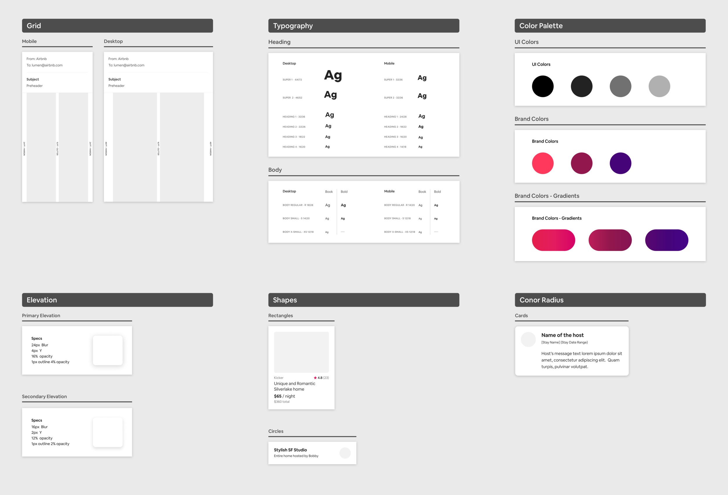
An evolving system of reusable components
The Email Design System is an evolving library of reusable components and lockups for creating and designing email templates at Airbnb — composed of primitives, elements, buttons, and email containers.
Designers previously pulled components from the core design system, but once the Growth & Traffic team owned email, the art director and UX leads decided to build an extension purpose-made for email — with its own structure, grid, and typography that fit the platform better.
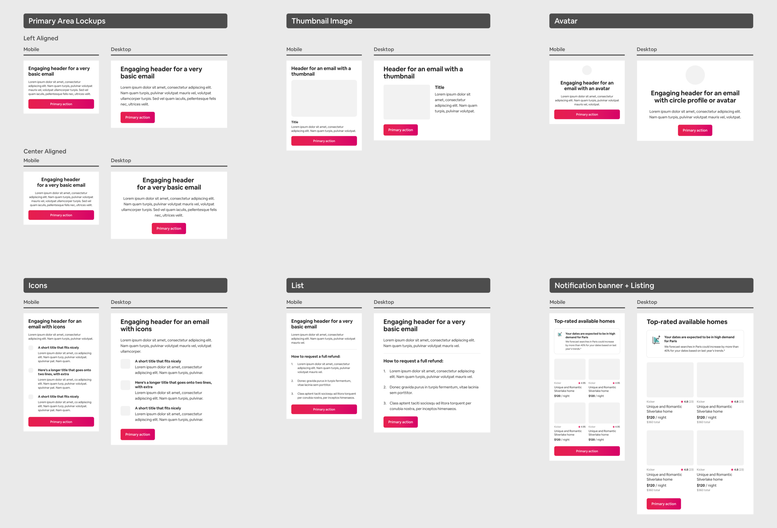
The primary area, for every email
The primary area is required for all emails, transactional or marketing. It holds the main message and purpose of the email and sits near the top. Primary-area lockups include:
- With body text and button
- With thumbnail image
- With icons
- With avatar
- With list
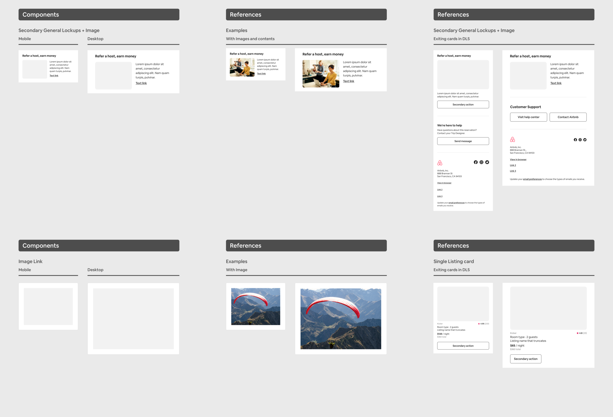
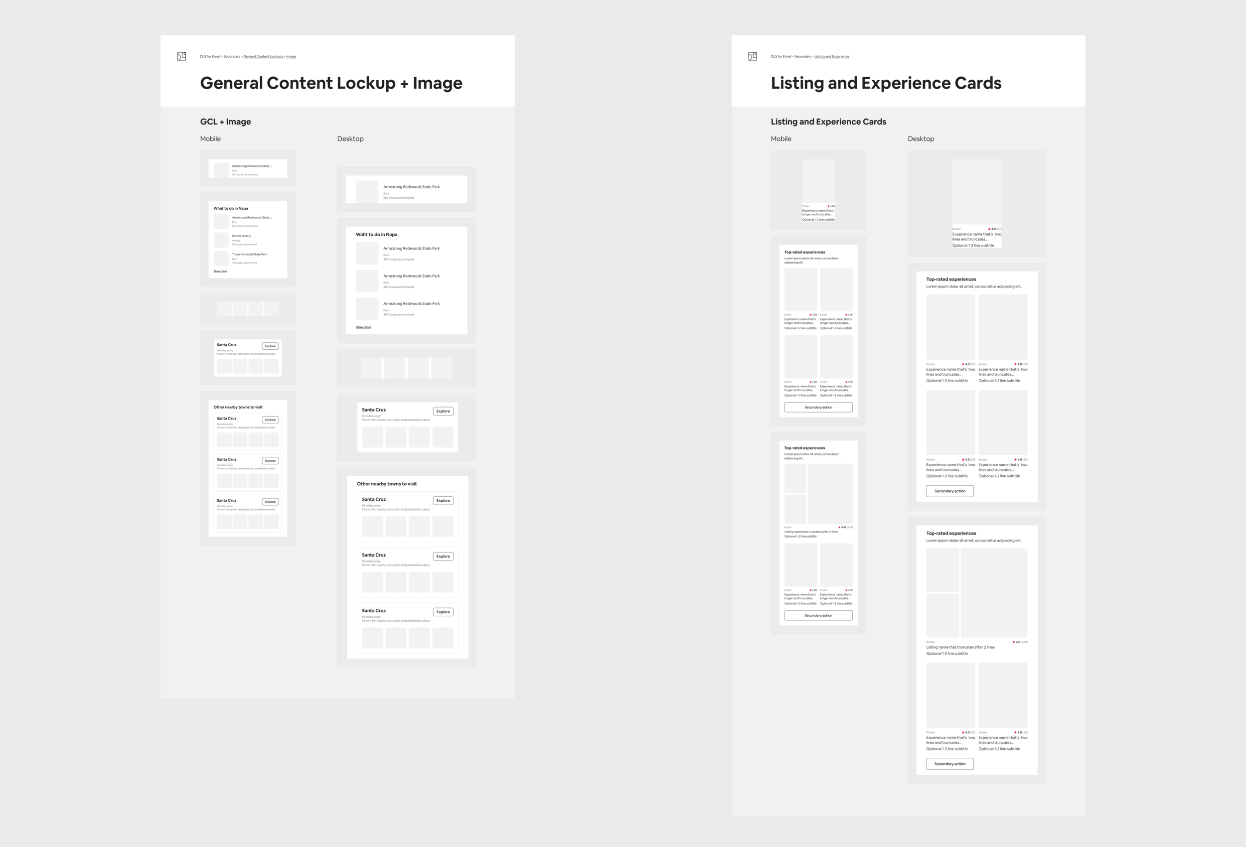
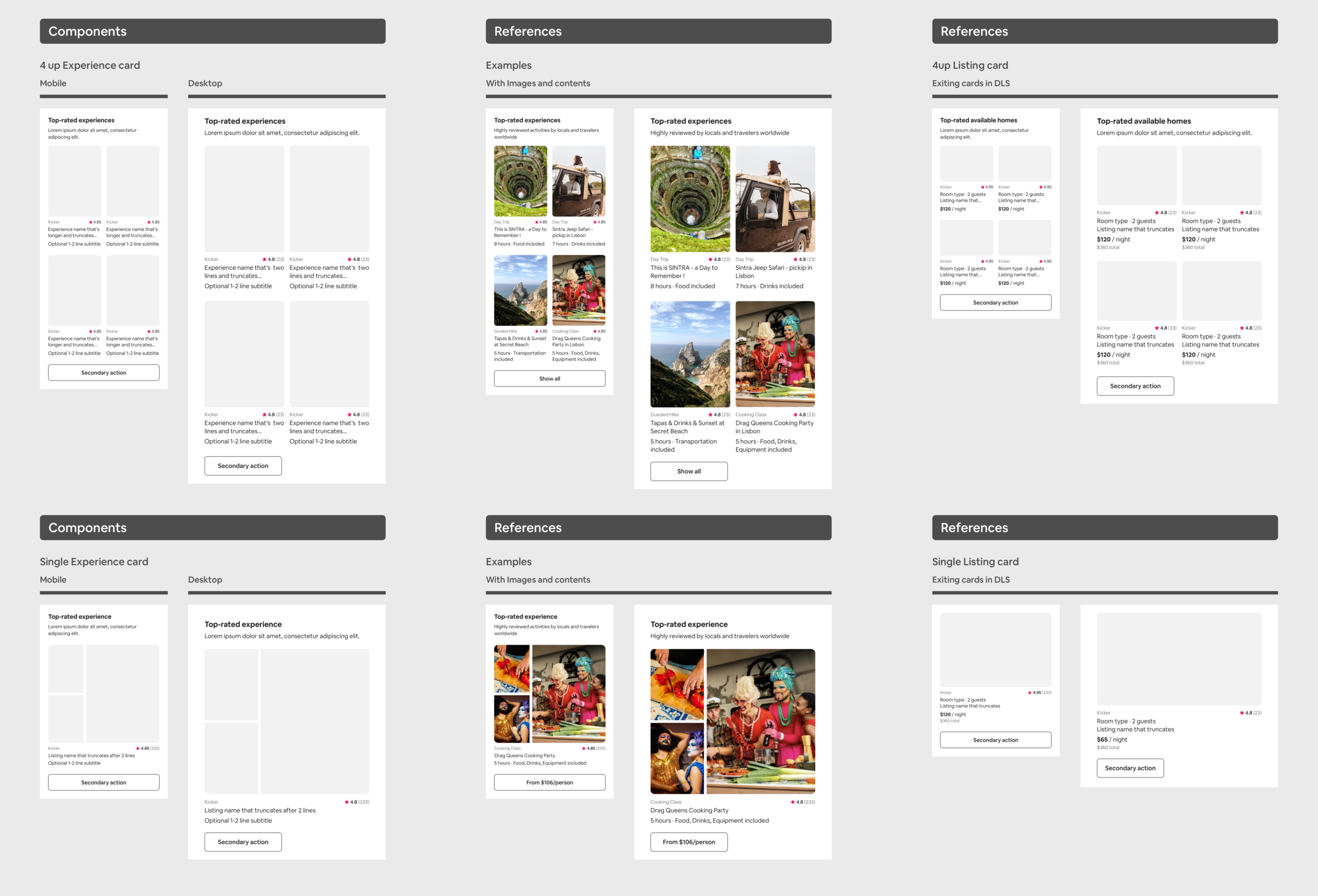
Listing cards for new products
After Airbnb launched Experiences and Adventures, I created new listing cards that support different ratios and image crops — increasing click rates and giving designers more flexibility in layout.
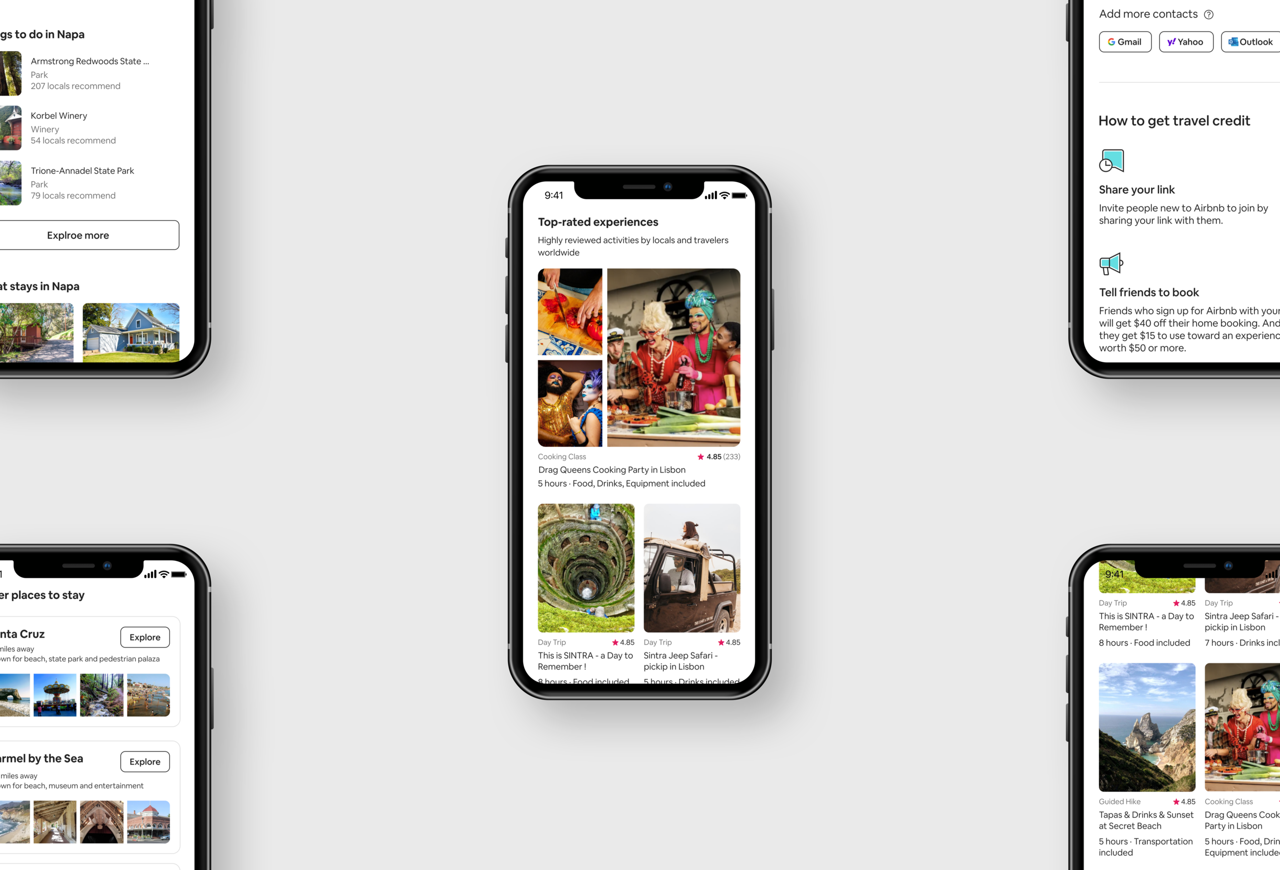
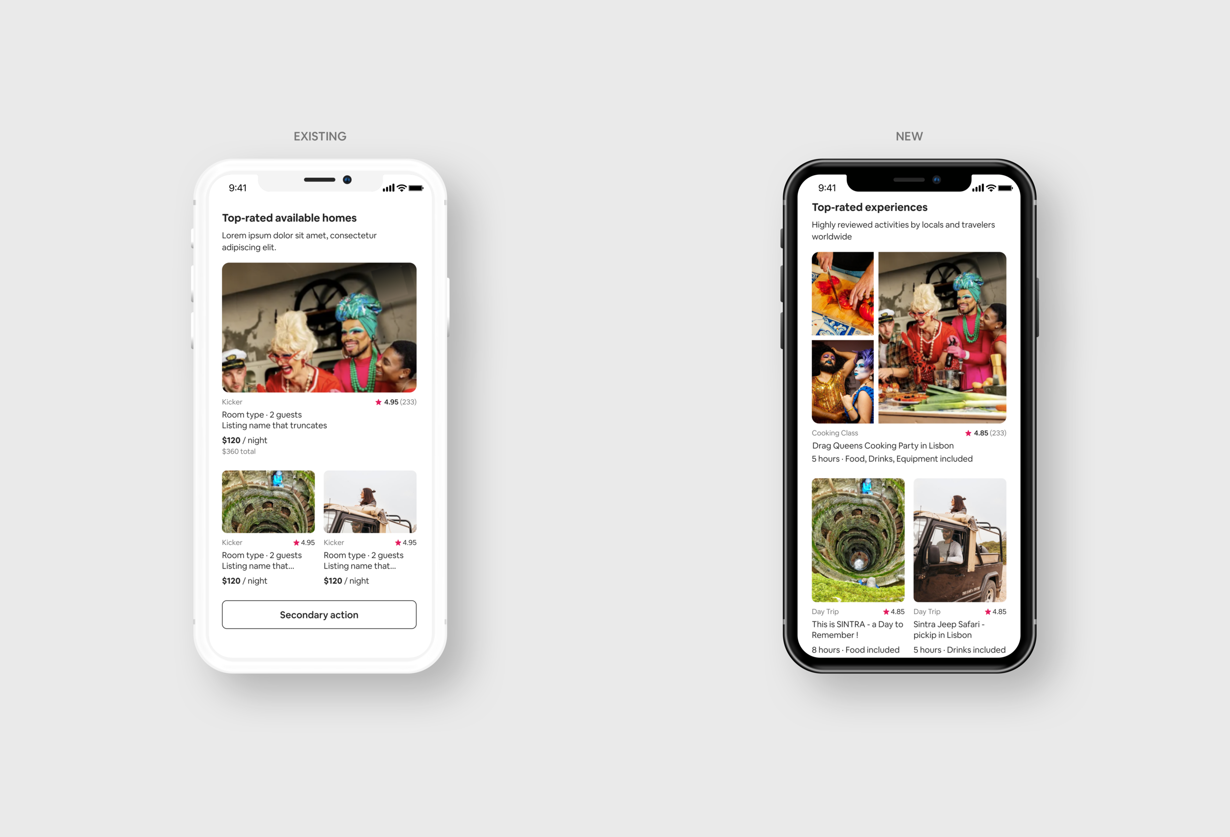
Portrait ratios to show people in depth
Many new Experiences products needed people in the image content. The existing cards only supported a 4:3 landscape ratio, so I added portrait sizes across collage listing cards, regular cards, and 2-up and 4-up layouts — tall containers that work well when designers want to show people or depth.
Across mobile and desktop, I built portrait versions of the Experience listing cards and collage components with 3-ups, all designed to mix and match. I wanted to audit toward “less is more” without preventing the creation of genuinely new components.
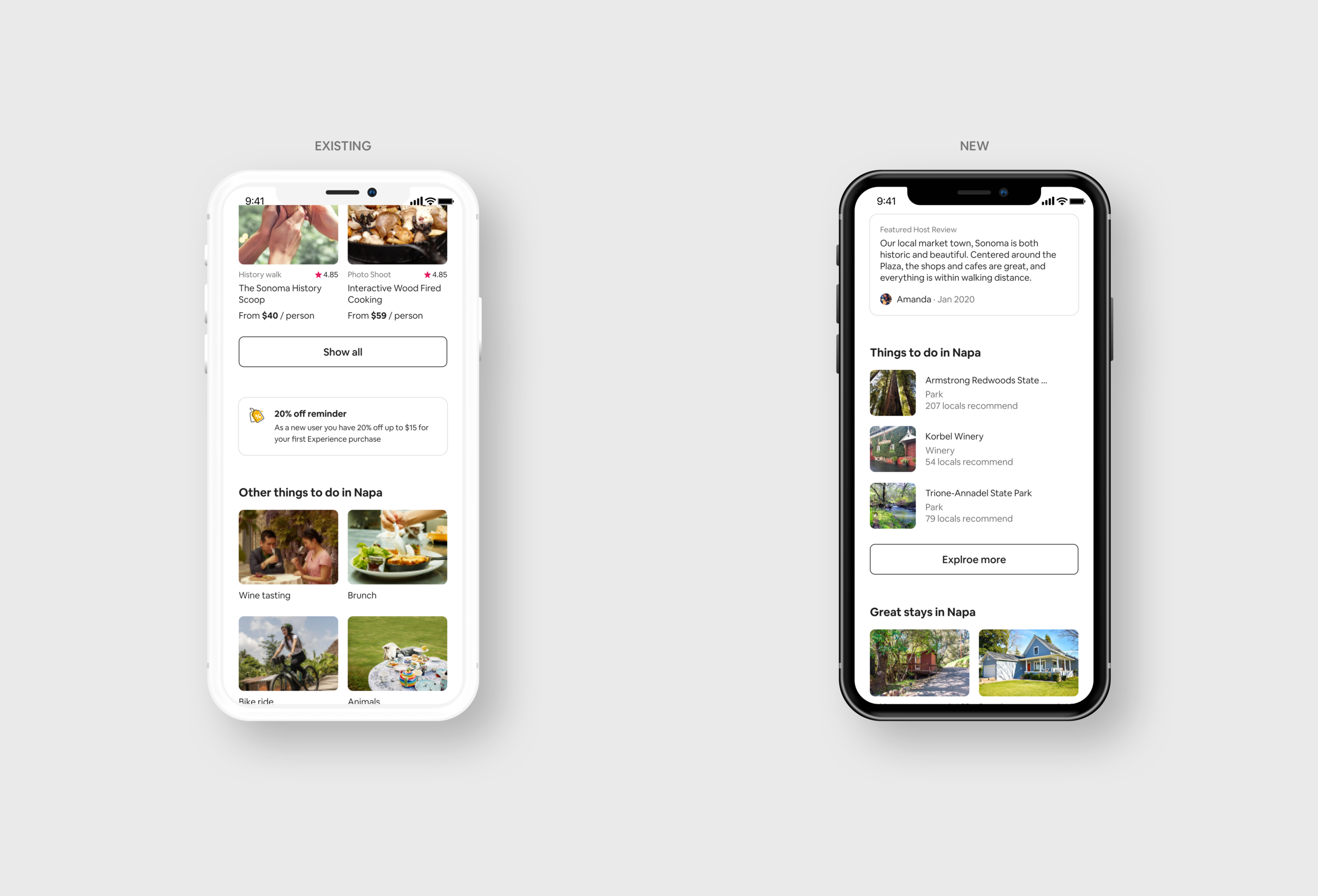
In-between sizes for richer engagement
As part of adding new container sizes and image layouts, the UX lead asked me to build engagement decks. We needed a medium thumbnail — an in-between of the regular and icon listings — to surface more listing information for a better experience.
New 1:1 content components and general content lockups for desktop and mobile were added. The thumbnail carousel shows more images in one organized, personalized component, while medium-thumbnail general lockups handle recommendations — filling the gap where existing containers were either too small or slightly too big.
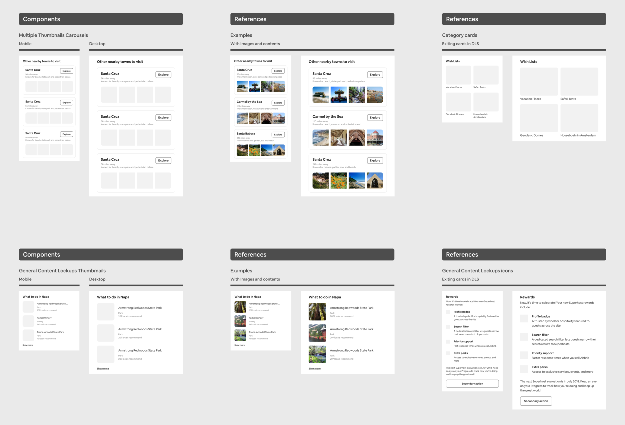
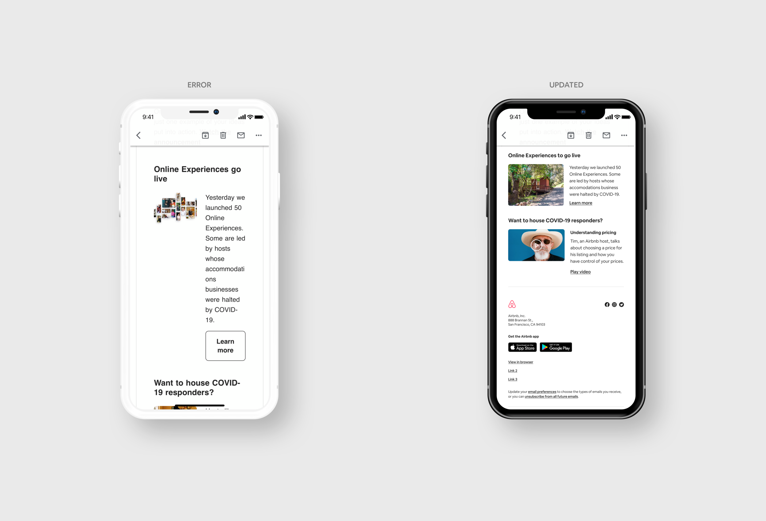
Fixing what testing surfaces
Work that looks perfect can still break in testing. A test send revealed a secondary lockup whose text box was too narrow and long, with a CTA button that looked odd on mobile. I rebuilt the component — adopting the layout from the video component and swapping the button for a text link.
I also unified the secondary general lockup so mobile and desktop share one layout, and added full-size image links — letting an image link directly to a page without any text link or button, as the Growth & Traffic art director wanted.